
A Guide to Accessible Interactive Components using React Libraries
Note: this blog is an archive and not actively maintained. Some information may be out of date. If you'd like to see what I am working on or work with me in a consulting capacity, visit my website lindseykopacz.com.
Content Warning: This blog post contains gifs.
I’ve wanted to write this blog post ever since I wrote a11y and JS - A Seemingly Unconventional Romance. I love JavaScript, and my job is to code in React. I often observe folks (rightly) critique that React Apps are inaccessible. According to the WebAIM Million report, “the adoption of [React] corresponded with [5.7%] more accessibility errors than the average home page.”
WebAIM Million tests the sample using the WAVE stand-alone API. The WAVE tool catches all crawlable issues, which don’t involve a ton of interactivity. I’m not going to use this blog post to talk about those issues. If you’re interested in learning more about that, I’ve created an Email Course on the topic.
There are two points that I want to drive home about JavaScript frameworks:
First, Front End JavaScript Frameworks render HTML. Second, JavaScript frameworks don’t produce inaccessible HTML. Web developers produce inaccessible HTML.
Before you read this blog post, I’d recommend brushing up on how to fix some common HTML errors.
There are a decent amount of folks who know how to write accessible HTML using React. For those folks, I’ve created a reference for creating accessible interactive components. I want to remove the barrier and utilize well-supported libraries.
I write this under the assumption that you are familiar with React basics and the syntax of JSX. If you are not familiar with it, I suggest that you read through the following resources:
- Read through the React docs and play around with their Tutorial.
- Have a basic familiarity with React Hooks, particularly useState and useEffect.
- Understand using the spread operator into a React Component.
- Understand how the children prop is used in React.
- Understand the map array method.
- Have a basic understanding of using
npmif you are using the command line. Tatiana Mac goes over a ton of the basics in her eleventy series if you want a great and funny intro to npm and the command line.
I use CodeSandbox for my examples. It will help you play with the code without setting up an environment. I recommend forking my examples, playing with the styling, and manually test the components.
React Hamburger Menu
NOTE: This is using react-burger-menu version 2.6.13. I’ll do my best to keep this blog post up to date
One React library I like to use if I am in a pinch is the react-burger-menu. Fun fact, my first contribution to open source was to this library! And of course, it was an accessibility improvement. Naturally 💁🏼♀️.
What are some features of an accessible hamburger menu?
- The hamburger button has a clear focus state.
- The hamburger button has some text that labels it, even if it’s visually-hidden.
- You cannot focus on the links inside the menu when the menu is closed. This experience happens very often when we have a menu that slides in.
- The menu closes on the Escape keypress.
- There is a clear way to close the menu, like a Close button inside the menu, or use the hamburger button to close it.
Below I’ve created a quick demo of what we expect the functionality to be:
How to install:
- If you’re on your local: In your project directory, enter
npm install react-burger-menuin the command line. If you are in CodeSandbox, go to the “Dependencies” section and addreact-burger-menuas a dependency. There are many different hamburger menu animation styles you can use. I choseslidefor this example, but you can see how all the options animate in the demo. - In the
srcdirectory, create a component calledBurgerMenu.js. Import the desired Menu animation and use that component to add links to your menu. I am using thenoOverlayprop on my Menu because I don’t like the look of overlays.
import React from 'react'
import { slide as Menu } from 'react-burger-menu'

const BurgerMenu = () => {
  return (
    <Menu noOverlay>
      <a className="menu-item" href="/">
        Home
      </a>
      <a className="menu-item" href="/about">
        About
      </a>
      <a className="menu-item" href="/contact">
        Contact
      </a>
    </Menu>
  )
}

export default BurgerMenu- Add it to the
App.jscomponent.
import React from 'react'
import './styles.css'
import BurgerMenu from './components/BurgerMenu'
export default function App() {
return (
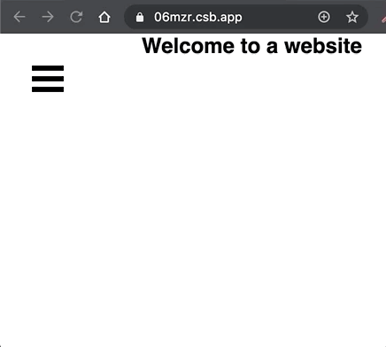
<div className="App">
<BurgerMenu />
<div>
<header>
<h2 style={{ margin: 0 }}>Welcome to a website</h2>
</header>
</div>
</div>
)
}- Create a CSS file and import it into your react component. Add some CSS to position some of the elements.
import React from 'react'
import { slide as Menu } from 'react-burger-menu'

import './burger.css'
.bm-burger-button {
position: fixed;
width: 36px;
height: 30px;
left: 36px;
top: 36px;
}
.bm-burger-bars {
background: #000;
}
.bm-cross-button {
height: 24px;
width: 24px;
}
.bm-cross {
background: #bdc3c7;
}
.bm-menu-wrap {
position: fixed;
height: 100%;
}
.bm-menu {
background: #373a47;
padding: 2.5em 1.5em 0;
font-size: 1.15em;
}
.bm-item-list {
padding: 0.8em;
}
.bm-item {
display: block;
color: #bdc3c7;
}Even if a library says it’s accessible, I always do some manual testing with both my keyboard and VoiceOver.
- Navigate through the component on a keyboard 👍
- Go through the hamburger menu using VoiceOver on Safari.
When we use Voiceover, we navigate to visually-hidden menu items. We can remedy this by adding aria-hidden and toggling it on menu open. Because the library doesn’t include this attribute, we will add an effect (useEffect) on the parent component. I made that conclusion because I saw a note about properties in the docs. I’ll add that attribute to the appropriate element when the component has mounted. Learn more about the useEffect hook.
In the App.js parent component, we want to set the aria-hidden attribute on the bm-menu-wrap class:
export default function App() {
  React.useEffect(() => {    const menuWrap = document.querySelector('.bm-menu-wrap')    if (menuWrap) {      menuWrap.setAttribute('aria-hidden', true)    }  }, [])
  return (
    <div className="App">
      <BurgerMenu />
      <div>
        <header>
          <h2 style={{ margin: 0 }}>Welcome to a website</h2>
        </header>
      </div>
    </div>
  )
}
In the react-burger-menu docs, I saw the onStateChange prop. I am going to use that to toggle the aria-hidden attribute dependent on the isOpen state.
<Menu noOverlay onStateChange={toggleMenu}>
  {/* All the links */}
</Menu>
const toggleMenu = state => {
console.log(state)
}I prefer using destructuring to save a couple of lines of code. Read more about destructuring assignment in the MDN Docs (go to the “Unpacking fields from objects passed as function parameter” section).
const toggleMenu = ({ isOpen }) => {
  console.log(isOpen)
}
Then I use the isOpen state to control the aria-hidden attribute value.
const toggleMenu = ({ isOpen }) => {
  const menuWrap = document.querySelector('.bm-menu-wrap')
  isOpen
    ? menuWrap.setAttribute('aria-hidden', false)
    : menuWrap.setAttribute('aria-hidden', true)
}
Now we want to make sure that everything is working how we would expect on a screen reader.
On VoiceOver:
As a note:
As of this writing, the Menu doesn’t work if you add a menu using unordered lists of list items. I found why that is in the code, and I plan on making a PR when I finally have some spare time 😁. I prefer to write my menus using unordered lists. However, I wanted to be sure I made that disclaimer, so you didn’t have to go through the debugging pain that I did.
React Modal
NOTE: This is using react-modal version 3.11.2. I’ll do my best to keep this blog post up to date
First, let’s go over what makes a modal accessible:
- Can’t focus inside of the modal until it’s open. If someone cannot see where their keyboard is focused, this is poor user experience.
- When the modal is open, focus trapping occurs. Focus trapping means that when the blur event occurs on the last focusable element of the modal, we go to the top of the modal content. This process ensures focus won’t be anywhere else on the screen except inside the modal, and it won’t be “behind” it.
- Closes on ESC keypress.
- Upon close, focuses on the thing it was on last.
How to install:
- If you’re on your local: In your project directory, enter
npm install react-modalin the command line. If you are in CodeSandbox, go to the “Dependencies” section and addreact-modalas a dependency. - In the
srcdirectory, create a component calledModal.js. ImportReactModaland create the base of your function component.
import React from 'react'
import ReactModal from 'react-modal'

const Modal = () => {
  return (
    <ReactModal>
      <p>Hey</p>
    </ReactModal>
  )
}

export default Modal- Attach the Modal to the root of your app. This line of code adds
aria-hiddenon the#rootwhen the modal is open and removes it when it is closed. Addingaria-hiddenhelps with focus trapping.
import React from 'react'
import ReactModal from 'react-modal'

ReactModal.setAppElement('#root')
const Modal = () => {
  return (
    <ReactModal>
      <p>Hey</p>
    </ReactModal>
  )
}

export default Modal- Add the
useStatehook to the Modal component. Use the hook to destructure anisOpenvariable andsetIsOpenfunction. The initial state of the modal being open isfalse(because we don’t want to start with an open modal)
import React, { useState } from 'react'import ReactModal from 'react-modal'

ReactModal.setAppElement('#root')

const Modal = () => {
  const [isOpen, setIsOpen] = useState(false)  return (
    <ReactModal>
      <p>Hey</p>
    </ReactModal>
  )
}

export default Modal- Next, we want to create two functions:
openModalandcloseModal. These functions set theisOpenstate.
const Modal = () => {
  const [isOpen, setIsOpen] = useState(false)

  const openModal = () => setIsOpen(true)  const closeModal = () => setIsOpen(false)
  return (
    <ReactModal>
      <p>Hey</p>
    </ReactModal>
  )
}- Now we want to add some props to
ReactModalto make it work the way we want to. The most important ones we want to pass areisOpenandonRequestClose.isOpentakes on theisOpenstate, andonRequestCloseshould take thecloseModalfunction. The latter is crucial to ensure that the Modal closes on the Escape key.
const Modal = () => {
  const [isOpen, setIsOpen] = useState(false)

  const openModal = () => setIsOpen(true)
  const closeModal = () => setIsOpen(false)

  return (
    <ReactModal isOpen={isOpen} onRequestClose={closeModal}>      <p>Hey</p>
    </ReactModal>
  )
}- This is great, but how are we supposed to open the Modal 😂? Let’s create a button to open the modal and pass the
onClickprop theopenModalfunction. I’ll place this button right before the ReactModal component. Because React must have a singular parent element, I am going to use a React Fragment. Read more about Fragments.
const Modal = () => {
  const [isOpen, setIsOpen] = useState(false)

  const openModal = () => setIsOpen(true)
  const closeModal = () => setIsOpen(false)

  return (
    <>
      <button onClick={openModal}>Open Me!</button>      <ReactModal isOpen={isOpen} onRequestClose={closeModal}>
        <p>Hey</p>
      </ReactModal>
    </>
  )
}- As it is, this Modal closes on the escape key. But I want to create a button that always inside the modal to close it to make it evident to non-keyboard users.
const Modal = () => {
  const [isOpen, setIsOpen] = useState(false)

  const openModal = () => setIsOpen(true)
  const closeModal = () => setIsOpen(false)

  return (
    <>
      <button onClick={openModal}>Open Me!</button>
      <ReactModal isOpen={isOpen} onRequestClose={closeModal}>
        <button onClick={closeModal}>Close</button>        <p>Hey</p>
      </ReactModal>
    </>
  )
}- Now that this is all configured, let’s make it dynamic with the children prop and a button text.
const Modal = ({ children, openButtonText }) => {  const [isOpen, setIsOpen] = useState(false)

  const openModal = () => setIsOpen(true)
  const closeModal = () => setIsOpen(false)

  return (
    <>
      <button onClick={openModal}>{openButtonText}</button>      <ReactModal isOpen={isOpen} onRequestClose={closeModal}>
        <button onClick={closeModal}>Close</button>
        <div>{children}</div>      </ReactModal>
    </div>
  )
}- And on our App component, let’s add the Modal component and the props!
import React from 'react'
import Modal from './components/Modal'
import './styles.css'
export default function App() {
return (
<div className="App">
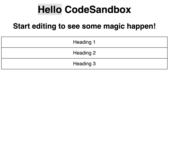
<h1>Hello CodeSandbox</h1>
<h2>Start editing to see some magic happen!</h2>
<Modal openButtonText="Sign up!">
<form>
<div>
<label for="email-input">Email:</label>
<input type="email" id="email-input" name="email" />
</div>
<div>
<label for="password-input">Password:</label>
<input type="password" id="password-input" name="password" />
</div>
</form>
</Modal>
</div>
)
}Now we manually test as always.

Note: I wanted to do the “harder” ones first. The reason I consider the previous two harder is because they take a smidge of configuration, and you have to know where the loopholes are. The next two sections will be less complicated as they need no setup out of the box to be accessible. All you need to do is follow the documentation. I’ll pretty much be walking you through my understanding of the docs and what the standard features are.
React Accordion
NOTE: This is using react-accessible-accordion version 3.0.1. I’ll do my best to keep this blog post up to date
To get up an accessible accordion, I use react-accessible-accordion. Here are the features of an accessible accordion:
- The Accordion Headings are buttons that open and close on
spaceorenter - Pressing the tab key moves to the next focusable element.
- Cannot access the inside of a closed accordion with the keyboard.
- Up & Down Arrow goes to the Previous & Next Accordion header when focused on another accordion header.
How to install:
- If you’re on your local: In your project directory, enter
npm install react-accessible-accordionin the command line. If you are in CodeSandbox, go to the “Dependencies” section and addreact-accessible-accordionas a dependency. - In the
srcdirectory, create a component calledAccordion.js. We’ll be importing a bunch of components from the library, as shown below.
import React from 'react'
import {
  Accordion as AccordionComponent,
  AccordionItem,
  AccordionItemHeading,
  AccordionItemButton,
  AccordionItemPanel,
} from 'react-accessible-accordion'- Create the base of your function component.
import React from 'react'
import {
  Accordion as AccordionComponent,
  AccordionItem,
  AccordionItemHeading,
  AccordionItemButton,
  AccordionItemPanel,
} from 'react-accessible-accordion'

const Accordion = () => (
  <AccordionComponent>
    <AccordionItem>
      <AccordionItemHeading>
        <AccordionItemButton>Heading 1</AccordionItemButton>
      </AccordionItemHeading>
      <AccordionItemPanel>
        Lorem ipsum dolor sit amet, consectetur adipiscing elit. Aenean dapibus
        malesuada feugiat. Etiam commodo purus in ex pharetra vulputate. Nam
        mattis, lacus quis tristique dapibus, ante dolor vehicula est, sit amet
        feugiat risus neque ac odio. Pellentesque et vulputate magna. Nam
        suscipit condimentum dictum.
      </AccordionItemPanel>
    </AccordionItem>
    <AccordionItem>
      <AccordionItemHeading>
        <AccordionItemButton>Heading 2</AccordionItemButton>
      </AccordionItemHeading>
      <AccordionItemPanel>
        Fusce dapibus, libero sed finibus placerat, nunc augue pulvinar libero,
        in vehicula nisl nisi ac nunc. Vestibulum convallis magna id lacus
        rhoncus, in efficitur ante vehicula. Donec vel finibus ipsum, non
        gravida orci. Maecenas ornare urna vitae porta dignissim. In hac
        habitasse platea dictumst.
      </AccordionItemPanel>
    </AccordionItem>
    <AccordionItem>
      <AccordionItemHeading>
        <AccordionItemButton>Heading 3</AccordionItemButton>
      </AccordionItemHeading>
      <AccordionItemPanel>
        Vestibulum id volutpat ante, pharetra pharetra nunc. In suscipit turpis
        vel molestie consectetur. Duis eu congue massa. Duis eu ligula dictum,
        consectetur elit vitae, tristique nibh.
      </AccordionItemPanel>
    </AccordionItem>
  </AccordionComponent>
)

export default Accordion
Now let’s add it to the App component.
import React from 'react'
import './styles.css'

import Accordion from './components/Accordion'

export default function App() {
  return (
    <div className="App">
      <h1>Hello CodeSandbox</h1>
      <h2>Start editing to see some magic happen!</h2>
      <Accordion />
    </div>
  )
}
I want to make this Accordion more reusable. Instead of hardcoding the accordion headings and content, I want to pass a data array using a prop. Then we can map through the data and make our code cleaner.
const data = [
  {
    heading: 'Heading 1',
    body:
      'Lorem ipsum dolor sit amet, consectetur adipiscing elit. Aenean dapibus malesuada feugiat. Etiam commodo purus in ex pharetra vulputate. Nam mattis, lacus quis tristique dapibus, ante dolor vehicula est, sit amet feugiat risus neque ac odio. Pellentesque et vulputate magna. Nam suscipit condimentum dictum. ',
  },
  {
    heading: 'Heading 2',
    body:
      'Fusce dapibus, libero sed finibus placerat, nunc augue pulvinar libero, in vehicula nisl nisi ac nunc. Vestibulum convallis magna id lacus rhoncus, in efficitur ante vehicula. Donec vel finibus ipsum, non gravida orci. Maecenas ornare urna vitae porta dignissim. In hac habitasse platea dictumst. ',
  },
  {
    heading: 'Heading 3',
    body:
      'Vestibulum id volutpat ante, pharetra pharetra nunc. In suscipit turpis vel molestie consectetur. Duis eu congue massa. Duis eu ligula dictum, consectetur elit vitae, tristique nibh.',
  },
]
Now to add that data array as a prop on our Accordion component.
export default function App() {
  return (
    <div className="App">
      <h1>Hello CodeSandbox</h1>
      <h2>Start editing to see some magic happen!</h2>
      <Accordion data={data} />    </div>
  )
}
And then refactor our Accordion to map through the data.
const Accordion = ({ data }) => (
  <AccordionComponent allowZeroExpanded={allowZeroExpanded}>
    {data.map(({ heading, body }, i) => (
      <AccordionItem key={i}>
        <AccordionItemHeading>
          <AccordionItemButton>{heading}</AccordionItemButton>
        </AccordionItemHeading>
        <AccordionItemPanel>{body}</AccordionItemPanel>
      </AccordionItem>
    ))}
  </AccordionComponent>
)
And that’s all you need to do. Let’s test to make sure all the features are working.
On a keyboard:
And on voiceover:
A few cleanup items and personal preferences that have nothing to do with accessibility:
When I have more than one prop, I like to create an object of props and spread them into the component. I want to set allowZeroExpanded to true. So I will add the data array as a property to an object we’ll call accordionProps. We will also add an allowZeroExpanded property with a value of true.
const accordionProps = {
  data: [
    {
      heading: 'Heading 1',
      body:
        'Lorem ipsum dolor sit amet, consectetur adipiscing elit. Aenean dapibus malesuada feugiat. Etiam commodo purus in ex pharetra vulputate. Nam mattis, lacus quis tristique dapibus, ante dolor vehicula est, sit amet feugiat risus neque ac odio. Pellentesque et vulputate magna. Nam suscipit condimentum dictum. ',
    },
    {
      heading: 'Heading 2',
      body:
        'Fusce dapibus, libero sed finibus placerat, nunc augue pulvinar libero, in vehicula nisl nisi ac nunc. Vestibulum convallis magna id lacus rhoncus, in efficitur ante vehicula. Donec vel finibus ipsum, non gravida orci. Maecenas ornare urna vitae porta dignissim. In hac habitasse platea dictumst. ',
    },
    {
      heading: 'Heading 3',
      body:
        'Vestibulum id volutpat ante, pharetra pharetra nunc. In suscipit turpis vel molestie consectetur. Duis eu congue massa. Duis eu ligula dictum, consectetur elit vitae, tristique nibh.',
    },
  ],
  allowZeroExpanded: true,
}
Then we can add them in using the spread operator.
<Accordion {...accordionProps} />would be the same as
<Accordion
  data={accordionProps.data}
  allowZeroExpanded={accordionProps.allowZeroExpanded}
/>
React Tabs
NOTE: This is using react-tabs version 3.1.0. I’ll do my best to keep this blog post up to date
To get up an accessible tablist, I use react-tabs. Here are the features of an accessible tablist:
- It can only access the content of the tab that’s visible.
- Right arrow and left arrow keys switch the tab.
Getting started:
- If you’re on your local: In your project directory, enter
npm install react-tabsin the command line. If you are in CodeSandbox, go to the “Dependencies” section and addreact-tabsas a dependency. - In the
srcdirectory, create a component calledTabs.js. We’ll be importing a bunch of components from the library, as shown below.
import React from 'react'
import { Tab, Tabs as TabsComponent, TabList, TabPanel } from 'react-tabs'- Create the base of your function component.
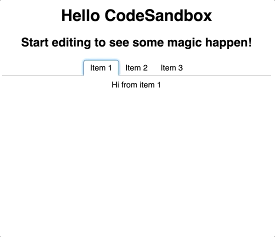
const Tabs = () => (
  <TabsComponent>
    <TabList>
      <Tab>Item 1</Tab>
      <Tab>Item 2</Tab>
      <Tab>Item 3</Tab>
    </TabList>
    <TabPanel>Hi from item 1</TabPanel>
    <TabPanel>Hi from item 2</TabPanel>
    <TabPanel>Hi from item 3</TabPanel>
  </TabsComponent>
)

export default Tabs
Now let’s add it to the App component.
import React from 'react'
import './styles.css'

import Tabs from './components/Tabs'

export default function App() {
  return (
    <div className="App">
      <h1>Hello CodeSandbox</h1>
      <h2>Start editing to see some magic happen!</h2>
      <Tabs />
    </div>
  )
}
We are going to do the same thing that we did for the Accordion component, and add a data prop and make that an array. We will map through to make all the tabs and panels.
const data = [
  {
    heading: 'Item 1',
    body: 'Hi from item 1',
  },
  {
    heading: 'Item 2',
    body: 'Hi from item 2',
  },
  {
    heading: 'Item 3',
    body: 'Hi from item 3',
  },
]
Now to add that data array as a prop on our Tabs component.
export default function App() {
  return (
    <div className="App">
      <h1>Hello CodeSandbox</h1>
      <h2>Start editing to see some magic happen!</h2>
      <Tabs data={data} />    </div>
  )
}
And refactoring the Tabs component using the map method.
const Tabs = ({ data }) => (
  <TabsComponent>
    <TabList>
      {data.map(({ heading }, i) => (
        <Tab key={i}>{heading}</Tab>
      ))}
    </TabList>
    {data.map(({ body }, i) => (
      <TabPanel key={i}>{body}</TabPanel>
    ))}
  </TabsComponent>
)
Then, as always, we manually test!
On a keyboard:
On VoiceOver:
Sources & React/JavaScript Resources
- a11y Matters - mobile navigation
- W3C-WAI Modal Features
- W3C-WAI Accordion Features
- W3C-WAI Tabs Features
All the React/JavaScript resources mentioned
- React docs
- React Tutorial.
- React Hooks.
- Using the Spread operator with Props
- The children prop in React
- .map() array method
- useEffect hook
- MDN Docs - Destructuring assignment
- React Fragments
Other Resources:
Conclusion
I wrote this blog post because I wanted to help React developers who care about creating inclusive apps, but get stuck overthinking accessible interactivity. I wanted to make sure there was an quick reference for some of the most common interactive components that are often not accessible. I hope this helps you!
If you liked this blog post and are interested in learning more about accessibility, take my 10 days of a11y free email course.
Cheers! Have a great week!

About Lindsey
Lindsey is an accessibility expert, JavaScript lover, and Front End Developer who's passionate about inclusivity both inside and outside the web. Read more about her on the About Page