
Create custom keyboard accessible checkboxes
Note: this blog is an archive and not actively maintained. Some information may be out of date. If you'd like to see what I am working on or work with me in a consulting capacity, visit my website lindseykopacz.com.
Content Warning: This blog post contains gifs.
I’ve seen a ton of designers make these GORGEOUS checkbox styles, but then you see them implemented and you can’t even select it using your keyboard. Let’s say we got this in our style guide from our designer.

I’ve seen this implemented before and it looks gorgeous. However, when I press the tab key, it zips right past it. If this field is required, you’re screwing over a bunch of your users. They use ::before or ::after pseudo-elements to make a pretty checkbox and use the :checked pseudo-class to determine the styling of the check itself. It looks cool, but the problem is that they use display: none on the checkbox input itself. When we do that, we make the checkbox itself invisible to the browser, making it unusable for those who rely on keyboards to navigate a site.
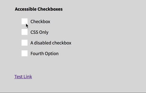
Starting point
Let’s walk step by step how I would go through this. Here is what my starting code looks like:
<fieldset>
  <legend>Accessible Checkboxes</legend>

  <input type="checkbox" name="Checkbox" id="check_1" />
  <label for="check_1">Checkbox</label>

  <input type="checkbox" name="CSS Only" id="css_only" />
  <label for="css_only">CSS Only</label>

  <input type="checkbox" name="" id="disabled_sample" disabled />
  <label for="disabled_sample">A disabled checkbox</label>

  <input type="checkbox" name="Fourth Option" id="fourth_check" />
  <label for="fourth_check">Fourth Option</label>
</fieldset>

I would start with a bare-bones checkbox list. Here is the current CSS I have:
input[type='checkbox'] {
  position: absolute;
}

input[type='checkbox'] + label {
  display: block;
  position: relative;
  padding: 0 1.5rem;
}
Create a pseudo-element on the label
The first thing I want to do is make sure that I create a pseudo-element that can act in place of my checkbox. What I’ll do to achieve this is create a ::before pseudo-element on the <label> element. Now it looks like this:
input[type='checkbox'] + label::before {
  content: '';
  position: relative;
  display: inline-block;
  margin-right: 10px;
  width: 20px;
  height: 20px;
  background: white;
}

I’ve left the non-styled original checkbox there on purpose. The reason for this is it makes it easier for me to tell when a checkbox is focused, checked, etc. It helps me to hold off on hiding the checkbox until the very last minute.
Add styling on the pseudo-element when checked
As of right now, when we try to check the checkbox, it doesn’t do anything except the normal behavior. What we have to do is add a little bit of CSS magic using the :checked pseudo-class. See Below:
input[type='checkbox']:checked + label::before {
  background: #5ac5c9;
}

Add your custom checkmark
If you want to do a checkmark unicode to the ::before element’s content, you can very well do that. However, I want to get a little fancy. Now, we want to make sure that there is a perpendicular checkmark inside of our custom element. I’ve done this by adding an ::after pseudo-element. What we are doing here is creating a right angle with two borders and rotating it.
input[type='checkbox']:checked + label::after {
  content: '';
  position: absolute;
  top: 3px;
  left: 27px;
  border-left: 2px solid black;
  border-bottom: 2px solid black;
  height: 6px;
  width: 13px;
  transform: rotate(-45deg);
}

An additional challenge, instead of a check, make an “X.”
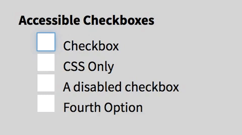
Add focus styles to the pseudo-element
Great! Are we good to go now? Well, not quite.
We still need to ensure that the pseudo-element “receives focus.” What we are going to do now is replicate the focus styling on when the checkbox receives focus. The reason why we don’t want to do display: none is because removing the display prevents the checkbox from receiving focus at all. I wanted to have some concrete focus styling since they can vary from browser to browser. Below is what I ended up doing because I wanted to replicate the default focus for Chrome, but in all browsers. It’s not the same, but it’s close!
input[type='checkbox']:focus + label::before {
  outline: #5d9dd5 solid 1px;
  box-shadow: 0 0px 8px #5e9ed6;
}

Now we can hide it the original checkbox! See how helpful keeping it around when we were figuring this out?
input[type='checkbox'] {
  position: absolute !important;
  height: 1px;
  width: 1px;
  overflow: hidden;
  clip: rect(1px 1px 1px 1px); /* IE6, IE7 */
  clip: rect(1px, 1px, 1px, 1px);
}
Note: I have used the visually-hidden styling here. I would normally use a Sass mixin or a class for this.
Add some styling for the disabled checkboxes
One last thing, we should probably make that disabled checkbox stylistically different. Below is what I did:
input[type='checkbox']:disabled + label {
  color: #575757;
}

input[type='checkbox']:disabled + label::before {
  background: #ddd;
}

So that’s it! You can apply the same principles to radio buttons as well.
If you liked this blog post and are interested in learning more about accessibility, take my 10 days of a11y free email course.
Cheers! Have a great week!
Disclaimer: I almost didn’t post this. Last night as I was scrolling through Twitter, I saw a post that has almost the same tips in it. After asking the Twitterverse if I should post it, I got an overwhelming amount of people saying “YES!” I haven’t read the other one, only skimmed, mostly because I didn’t want to impact my writing. However, I wanted to link it up for you, in case you wanted to read it: How to Make Custom Accessible Checkboxes and Radio Buttons.

About Lindsey
Lindsey is an accessibility expert, JavaScript lover, and Front End Developer who's passionate about inclusivity both inside and outside the web. Read more about her on the About Page